-
Hey you, yes you!
Signup is free AND easy!
Register today to unlock many more forums, and contribute to the newest Bulldogs Fan Community!
You are using an out of date browser. It may not display this or other websites correctly.
You should upgrade or use an alternative browser.
You should upgrade or use an alternative browser.
The history of NRL clubs logos. Part one (Clarkey)
- Thread starter Captain Ibis
- Start date
Captain Ibis
Squad Member
Captain Ibis
Squad Member
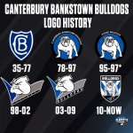
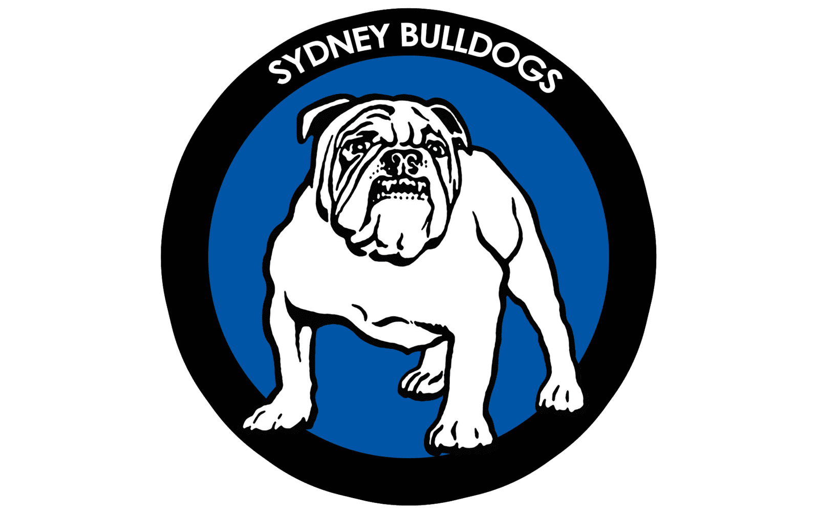
Some great history here. I like all our logos bar the floating head. I like that the CB monogram gets a good run these days too. The original Bulldogs face was awesome, but I think what we have now is more suitable to the modern era of sporting logos.
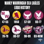
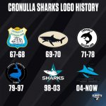
There's some funny ones in there as well, such as the 69-70 Cronulla logo which looks like a walking shark, and the blob with an eye that is the 57-59 Manly logo.
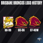
Broncos really need to do a re-design of the original horse imo.
There's some funny ones in there as well, such as the 69-70 Cronulla logo which looks like a walking shark, and the blob with an eye that is the 57-59 Manly logo.
Broncos really need to do a re-design of the original horse imo.
Last edited:
Wahesh
Beast by Name, Beast by Nature
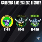
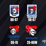
Yeah and there's also quite a few that fall under the radar. For instance, I had no idea the Broncos and Raiders had a re-designed one given how minor the changes are.Some great history here. I like all our logos bar the floating head. I like that the CB monogram gets a good run these days too. The original Bulldogs face was awesome, but I think what we have now is more suitable to the modern era of sporting logos.
There's some funny ones in there as well, such as the 69-70 Cronulla logo which looks like a walking shark, and the blob with an eye that is the 57-59 Manly logo.
Broncos really need to do a re-design of the original horse imo.
What I do miss about the modern sporting logos is that I remember back in the 90s, most teams had their logos encased in either a crest or a circle. Classics the come to mind are ours, Cronulla and Balmain. I just found those designs that were in the circle to be uniquely Australian.
Captain Ibis
Squad Member
Yeah and there's also quite a few that fall under the radar. For instance, I had no idea the Broncos and Raiders had a re-designed one given how minor the changes are.
What I do miss about the modern sporting logos is that I remember back in the 90s, most teams had their logos encased in either a crest or a circle. Classics the come to mind are ours, Cronulla and Balmain. I just found those designs that were in the circle to be uniquely Australian.
They both definitely are an improvement, the Raiders logo especially. I love the updated Viking, I thought the former version was good but in particular the update palette is brilliant.
Yeah those circle border logos are so iconic and everyone of the logos from that era is so memorable.. I always look at them as being perfect beanie logos lol
So manly have had the oldest logo (according to the teams displayed).
Raiders is about the only one that has improved in my opinion.
Raiders is about the only one that has improved in my opinion.
Wahesh
Beast by Name, Beast by Nature
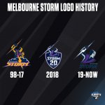
Melbourne had the right idea of a logo with a crest but it was only for 1 season for their 20 years. They should've made it more long term. Instead of "20 Years" they could've put something else like "Est. 1998" (or was it 1997? I know they entered the comp in 1998 but were probably established in 1997).So manly have had the oldest logo (according to the teams displayed).
Raiders is about the only one that has improved in my opinion.
Captain Ibis
Squad Member
Their current logo is not bad but it lacks a bit of punch.. it's got a bit of a corporate feel about it.. The crest was good I'm just wondering how they'd fill it out without the 20 years text.. you wouldn't want to scale up the character up anymore because the proportions wouldn't match the crest
BomberBurton
Sending them high in the sky.
35-77 just feels timelessly classy for us.
Should go back to imo.
Should go back to imo.
Captain Ibis
Squad Member
Haha he looks like he's been struck on the noggin by a Burton special.
Captain Ibis
Squad Member
Somebody on Reddit suggested we use the Bulldog sans the badge, and I was thinking that wouldn't be bad, but upon inspection I think a full white (with shading) probably wouldn't stand out on a white jersey, even with part of the logo sitting on top of the V. Sorta like this but with the team name below.


Wahesh
Beast by Name, Beast by Nature
I actually like our logo in a crest, however it could've been better. I would've preferred the old Bulldogs we used to use that looked like he was ready to tear anything apart lol, and also the Berries stripes instead of the blue V. It would've been perfect.

Captain Ibis
Squad Member
I actually like our logo in a crest, however it could've been better. I would've preferred the old Bulldogs we used to use that looked like he was ready to tear anything apart lol, and also the Berries stripes instead of the blue V. It would've been perfect.

The only thing I find weird about that Bulldog is the amount of line detail on the face, and then nothing on the body. It was definitely good for that era though.
