-
Hey you, yes you!
Signup is free AND easy!
Register today to unlock many more forums, and contribute to the newest Bulldogs Fan Community!
You are using an out of date browser. It may not display this or other websites correctly.
You should upgrade or use an alternative browser.
You should upgrade or use an alternative browser.
2022 Jersey Discussions
- Thread starter spiritofaslan
- Start date
Captain Ibis
Squad Member
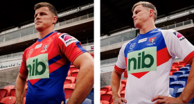
Minus the logo they're not bad, particularly the home jersey, which would look alright on its own. I honestly can't see any way they can make their 2022 jersey look good while having to use that logo.
Faded Red and blue background, with a white or black NIB logo?Minus the logo they're not bad, particularly the home jersey, which would look alright on its own. I honestly can't see any way they can make their 2022 jersey look good while having to use that logo.
That's be more in fitting with the jersey.
Captain Ibis
Squad Member
Faded Red and blue background, with a white or black NIB logo?
That's be more in fitting with the jersey.
The green box with white text still ain't great but was better than this one. I know brands are picky with how their logo is used but surely they can all come to an agreement on something better than that hideous thing above
Old Woof Woof
Squad Member
Could have been worse could have been "Nibble " inscribed across where their nipples sitMinus the logo they're not bad, particularly the home jersey, which would look alright on its own. I honestly can't see any way they can make their 2022 jersey look good while having to use that logo.
Old Woof Woof
Squad Member
Glad they didnt get it back to front and print "Bin' instead lol
Captain Ibis
Squad Member
Glad they didnt get it back to front and print "Bin' instead lol
they don't need to, we already know where it belongs!
Captain Ibis
Squad Member
Captain Ibis
Squad Member
I was honestly thinking those looked alright till I saw the lines at the top and also the random fade/spray in effect.. they look more like a Nines jersey than a regular season jersey.
Not sure what it is about NRL but I feel like jersey designers often try too hard; they should take a leaf out of the AFL's book and keep it clean and consistent.
Not sure what it is about NRL but I feel like jersey designers often try too hard; they should take a leaf out of the AFL's book and keep it clean and consistent.
The alternative coloured stitching looks terrible.. If they carried the stripes across onto the shoulders and the rear of jersey it could have looked good though.
Captain Ibis
Squad Member
The alternative coloured stitching looks terrible.. If they carried the stripes across onto the shoulders and the rear of jersey it could have looked good though.
I don't know why they decided to make it significantly different to their 2021 jersey, which imo was probably their best jersey of recent.

